

CAPTUR: Branding a new authority for an entire profession
A CASE STUDY
How two merging organizations became one named, positioned, and visually unmistakable brand.
Overview
When two of the most respected organizations in court reporting decided to merge, they needed more than a new logo. The American Association of Electronic Reporters and Transcribers (AAERT) and the Society for the Technological Advancement of Reporting (STAR) were joining forces at a charged moment for the profession, with technology and the future of the record under active debate. The new organization needed a single identity that could honor two legacies, unite two memberships, and carry the authority to lead.
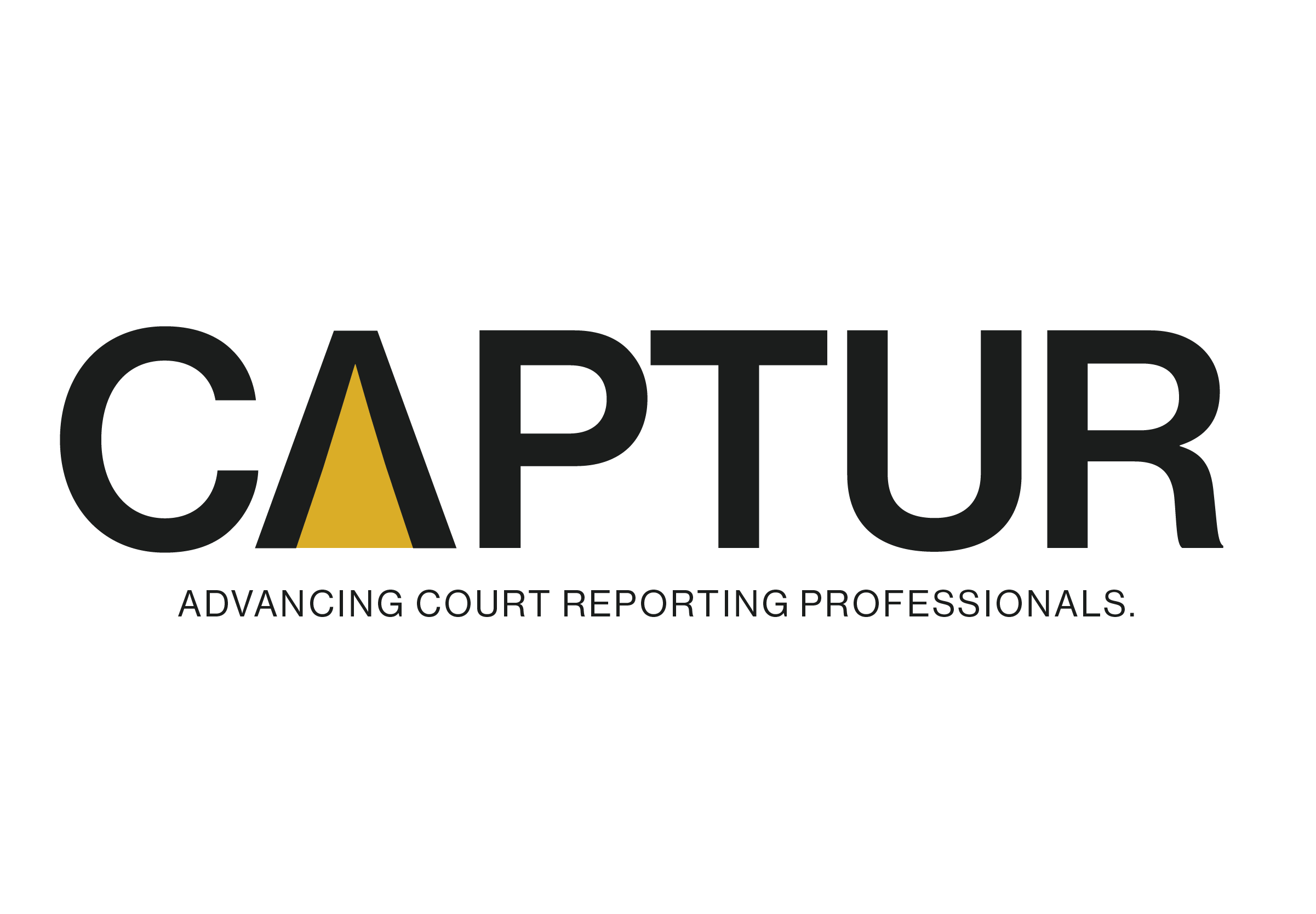
I led design and creative direction, in partnership with brand strategist Nakita Pope (Branding Chicks), on strategy and messaging. The work moved from discovery and stakeholder interviews through naming, positioning, and a full visual identity, landing on CAPTUR: a bold black wordmark whose “A” opens into a gold form that reads at once as an upward arrow and a shaft of light, a spotlight on the profession. That single shape carries the brand and stands on its own as the organization’s mark.
The brand was built with the people who would live inside it, not handed down to them. Keeping leadership and the merger committee in the room as collaborators meant the identity they launched was one they understood, believed in, and could carry forward on their own.
“You have put so much time and effort into this process. You’ve been so responsive and listening. I feel like you’ve learned so much about our industry.”


PROJECT GOALS
Unite two legacy organizations under one brand without it reading as either one’s sequel
Name the new organization in a way that is ownable, searchable, and meaningful to members
Establish visual authority that holds its own against incumbents while staying distinct in a crowded category
Position the brand as boldly future-facing and unmistakably human, with technology in service of people
Deliver core identity and pre-conference assets ahead of the merger-vote deadline
ROLES & RESPONSIBILITIES
Design & Creative Director, in strategic partnership with brand strategist Nakita Pope, responsible for:
Co-leading discovery and stakeholder interviews across both organizations’ boards and committees
Shaping brand strategy and positioning, including the human and technology differentiator
Developing and rationalizing the organization’s name and acronym architecture (CAPTUR)
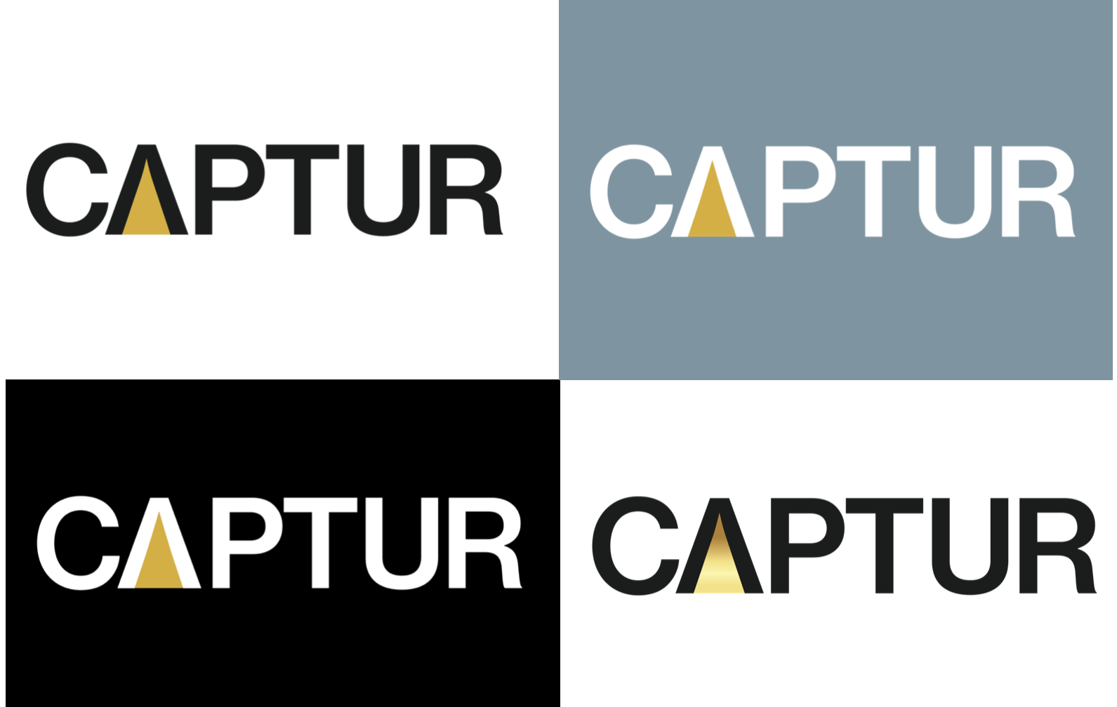
Designing the primary logo, the standalone “A” mark, the favicon, and the rules that govern their use
Building the color system and selecting typography, including flat and metallic gold application
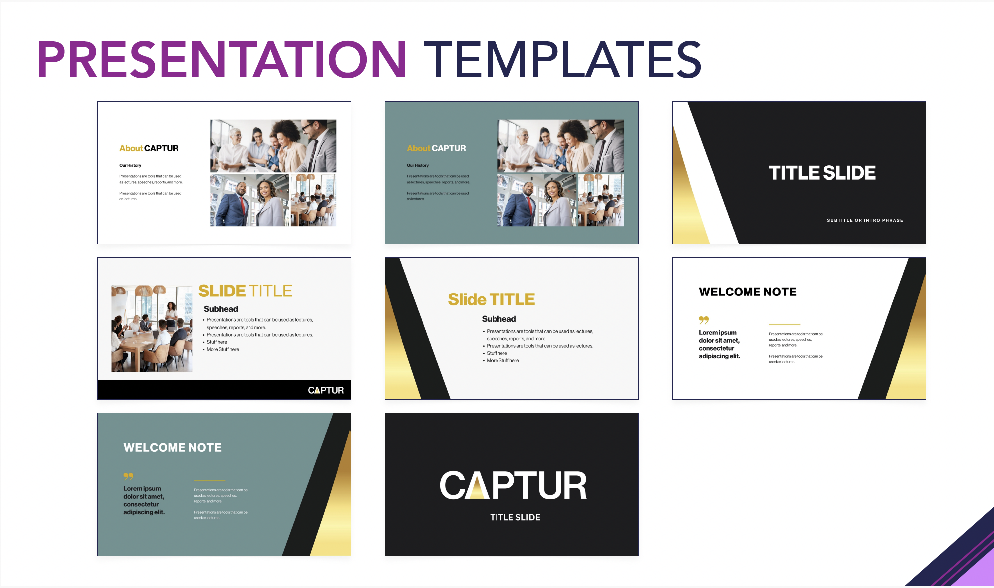
Co-producing a comprehensive brand and usage guide and pre-conference collateral, and guiding the client into rollout
DELIVERABLES
Discovery, synthesis, and stakeholder interview findings from both organizations
Brand strategy and positioning, including core values, audience, voice, and messaging guardrails
Organization name and acronym architecture, fully rationalized (CAPTUR)
Primary logo, standalone “A” mark, favicon, and logo usage rules
Color system (black, classic gold, Spring Meadow green) with flat and metallic application guidance
Typeface/font selection and licensing (Neue Haas Grotesque Display Pro)
Comprehensive brand and usage guide, covering logo usage, color values, voice and language, social media application, photography direction, positioning statements, and trademark guidance
Pre-conference collateral, including stationery and business cards
CREATIVE DIRECTION & DESIGN STRATEGY
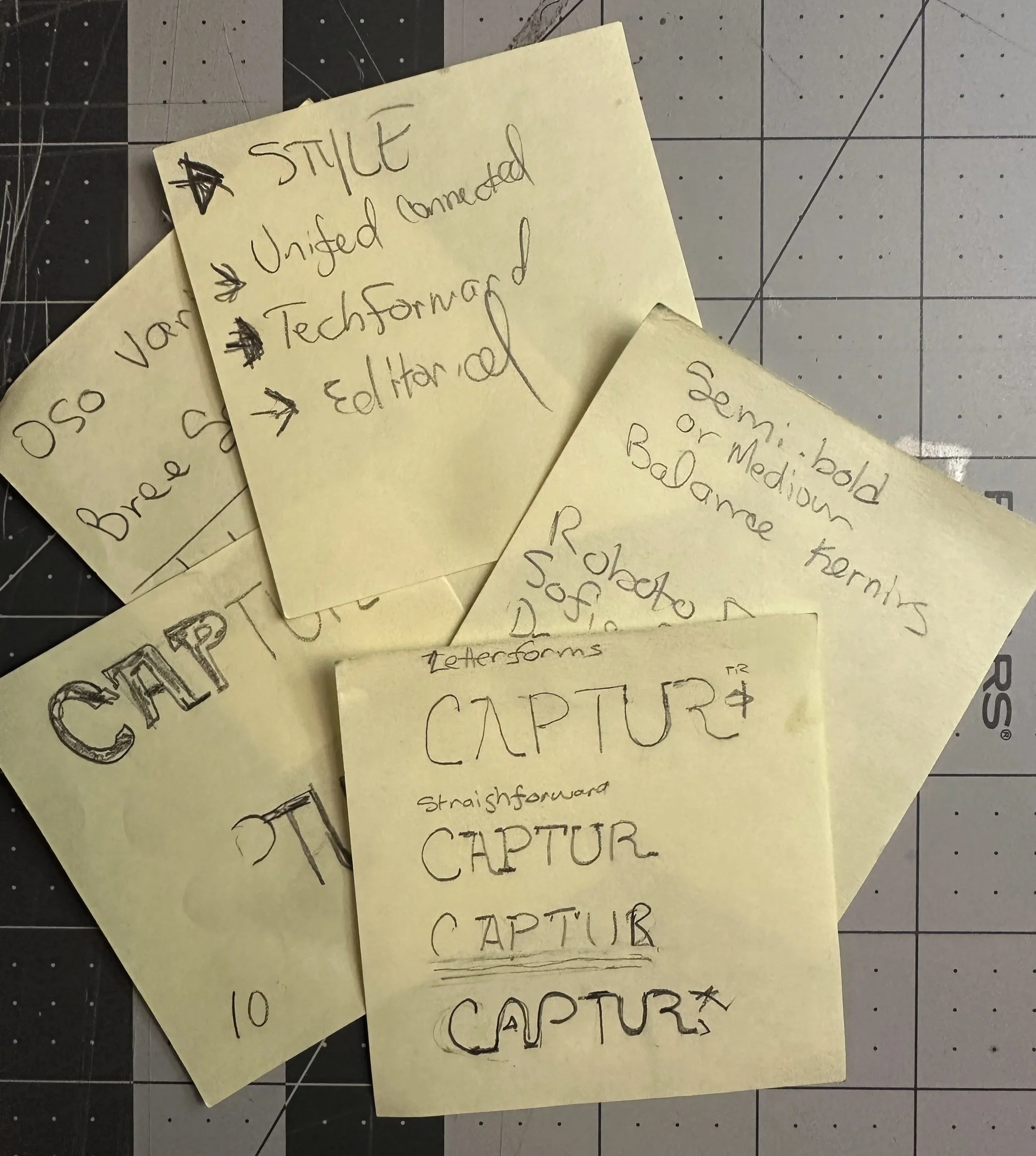
Preliminary logo sketches were done after extensive interviews and discovery.
Discovery produced the North Star. Asked where the brand should sit between tradition and innovation, leadership landed on a vivid shorthand: “Star Trek, not mad scientist.” Boldly future-facing and technologically fluent, but always led by people. That single phrase governed every decision that followed.
From it came the brand’s defining idea: human and technology, together. CAPTUR would stand apart from pure-tech competitors who position themselves by removing reporters from the equation, owning technology in service of people rather than in place of them. Just as important was what we chose to leave out. We mapped the negative space as carefully as the brand itself, ruling out any visual territory that echoed the legacy organizations, and deliberately avoiding blue, which sat too close to AAERT and to a dominant industry player, along with the blue-and-red palettes common to the category.
Naming came out of many rounds of exploration and a strategically reasoned shortlist, including Verum and Captus. Each option was pressure-tested against the realities of the industry, from trademark exposure to searchability. The idea that won was CAPTUR, built from the act of capturing the record, the thing every member does. It works as a word on its own and carries an acronym beneath it: Council for the Advancement of Professionals, Technology, and Unbiased Reporting.
On the visual side, I aligned the client on posture before pixels. Rather than presenting finished logos prematurely, I offered three conceptual directions, each expressing forward authority with a different emphasis, so the choice was about strategy rather than taste. The selected direction became a confident black wordmark built around a single idea: the “A” opens at its base, and the gold form inside it works two ways at once. It is an arrow of upward movement, and it is light, a spotlight shining on the profession as a whole. That dual reading is what makes the mark work on its own. Reduced to the gold “A” alone, as an icon or favicon, it still carries the full meaning of the brand, with room to flicker “on” in future motion graphics, a quiet nod to people and technology moving forward together.
Color and type carried the same logic. The palette is black and classic gold, with Spring Meadow green as a secondary accent, balancing stability with forward energy while steering clear of the category’s blues. Gold is specified in two registers, flat for everyday use and metallic for special applications such as foil-printed cards. Typography is set in Neue Haas Grotesque Display Pro, engineered and modern without tipping into cold.
CHALLENGES & SOLUTIONS
Unify without erasing
Anchored the brand in a shared act, capturing the record, so both memberships could see themselves in it without either legacy dominating.
Authority amid industry friction
Built for more visual authority than incumbents while keeping the tone confident rather than combative, so the brand could lead the conversation instead of escalating it.
Future-facing, not alienating
Held the “Star Trek, not mad scientist” line, bold and forward-looking while keeping the human element front and center for a traditionally change-averse audience.
A hard deadline
Sequenced the work so naming and core identity landed ahead of the conference and merger vote, holding post-conference deliverables for later release.
RESULTS & Legacy
Board-approved name, logo, and brand direction, delivered ahead of the merger-vote conference
A unified identity that honors two legacies without looking like either one
A flexible mark, wordmark plus standalone gold “A”, that scales from favicon to conference signage
A complete strategic system where every visual choice traces back to the human and technology positioning
A foundation of a comprehensive brand guide, color, typography, and collateral that carried the client into active rollout
The TAKEAWAY
Great identity work isn’t decoration applied at the end. It’s a series of decisions, each tied to who an organization is and where it’s going. What to name a thing. What to leave out. Which gold to use, and when. CAPTUR is the kind of work I love most: high-stakes and emotional weight, and solvable only when strategy and design move together.
Partnering with Nakita made that possible, holding the head and the heart at once. Her strategy gave the design a backbone, and the design gave the strategy a face the industry could rally around. CAPTUR walked out of the process with more than a logo. It left with the clarity and confidence to use it, a single forward-looking brand for a profession that had been waiting for a place to belong.